Turning construction expertise into a growth engine
Stavba&Design is a construction company managing projects from apartment renovations to homes and large B2B developments. We turned 15 years of expertise and a highly structured process into a clear, scalable brand and digital presence.
Type
Services & Industry

From fragmented identity to market leader
Stavba&Design had built a strong reputation over 15 years, growing into one of the region’s leading construction companies. Their work ranged from apartment renovations and custom family homes to large B2B development projects. Behind it all was a systemized process led by dedicated project managers, who connected clients, workers, and every stage of the build.
But the brand did not reflect that strength. While their construction sites ran with structure and precision, their visual identity felt fragmented and inconsistent. Materials were created case by case, making it difficult to communicate the company’s scale, professionalism, and personal approach. Stavba&Design had already systemized the way they worked- now it was time to systemize how the brand showed up.


Step 1: Strategic foundation: uncovering the brand DNA
The process began with a series of discovery workshops where we dug deep into the core of the brand, and what really are the reasons their customers would choose them over competitors.
We discovered that Stavba&Design's real strength wasn't just their technical expertise-it was their ability to make complex construction projects feel manageable and human.


Core brand pillars identified:
Project Partnership: One project manager is your guide from start to finish-no matter the job size.
Technical x Aesthetic: Every project thoughtfully balances construction know-how and design sensitivity.
For everyone: Approachable for value-driven homeowners and credible enough for major developers.
Clarity above all: Clear, plain communication-never industry jargon.
This set the brand’s north star: to become the reliable, approachable partner at any scale - from a simple attic to a multi-million development.
Understanding the Customer Divide
The new identity had to work for two very different audiences: high-end developers who expected professionalism and scale, and everyday homeowners who needed warmth and trust. As the client said, “Don’t let the rebrand scare off the gran.” The challenge was to make Stavba&Design feel premium and capable without becoming cold or intimidating.



Step 2: Building the brand identity system
The Strategic Solution: Evolution, Not Revolution
Rather than completely reinventing the brand, we chose strategic evolution-preserving brand equity while dramatically elevating execution and consistency.
The root problem wasn’t just a weak logo, but the lack of a true brand identity system-no assets, no visual rules, no way for the team or partners to create consistent on-brand materials.
Our solution: build a library and a system, not just a facelift.
We set out to develop a complex identity system-a kit of parts engineered for consistency but flexible enough for all situations. Now, anyone-internal staff, architects, or outside partners-could communicate in a way that instantly felt like Stavba&Design.


Logotype
The Stavba&Design logotype visually expresses the brand’s dual focus. “Stavba” uses bold, geometric lettering with rounded corners to emphasize strength and solidity. “Design” appears in a lighter, elegant typeface, introducing creativity and refinement. This contrast clearly communicates the union of robust construction and thoughtful design.
Logo symbol
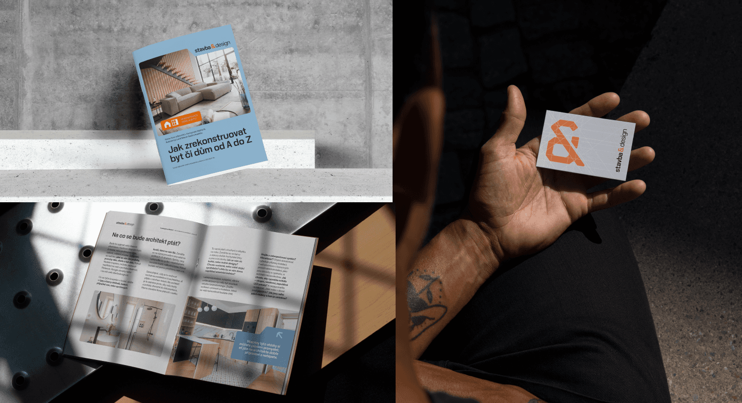
The logo symbol reimagines the ampersand (“&”), integrating the “S” and “D” into a sleek, geometric shape. Built with architectural grid lines, it conveys both technical structure and modern simplicity. Versatile and highly recognizable, it stands alone as a confident mark for Stavba&Design across all brand applications.


Patterns: Architectural grids
Taking cues from architecture, our brand patterns include:
- Bullet grid: Dotted layout for soft structure, suggesting planning and details.
- Square grid: Crisp, modular grid for layouts, referencing blueprints and technical precision.
These patterns are more than backgrounds-they help make any document instantly “on brand.”
Iconography
A custom set of icons were created, all derived from the visual language of the new symbol. Simple, geometric, and highly legible, they ensure every infographics or service communication is unmistakably Stavba&Design.


Templates & implementation guidelines
No more design guessing.
We created a library: proposals, presentations, brochures, signs, and more-ready to use, with a comprehensive brand manual. Now, internal teams and external partners can produce materials that always look and feel like Stavba&Design.


Step 3: Comprehensive roll-out - making the brand real
Over several months, we worked closely with the Stavba&Design team to roll out the new identity across all key touchpoints—ensuring it wasn’t just a folder handed over and forgotten, but a system built to be used. Every asset was created with real-world function and clarity in mind:
Business cards, brochures, client books, folders, and document packs were redesigned to make every sales and project touchpoint feel more professional and trustworthy. From the first introduction to final handover, each material now supports the same premium brand experience - helping the team present clearly, close deals with confidence, and reinforce trust throughout the whole client journey.

Site banners, panels, and the van fleet were redesigned to turn every jobsite into a visible brand touchpoint. Signage reinforces the identity directly on construction sites, while branded vans work as mobile billboards - seen around town, parked at projects, and constantly building recognition for Stavba&Design.

Step 4: Digital experience - alignment from first click to final call
We made sure that meeting the brand online mirrors the experience offline-clear, confident, and consistent. For most clients, the journey starts digitally, so it was essential that every click reinforced the same level of professionalism they’d encounter on-site or in a sales meeting.
Online Ads & PPC: We designed a set of high-performing ad creatives and display formats tailored for PPC campaigns-clear, on-brand, and conversion-focused. The visuals and messaging not only captured attention but aligned with the tone and identity found across every other touchpoint.


Social Media Branding: The brand’s presence on social platforms was refined to reflect its new identity-visually consistent, confident in tone-whether speaking to homeowners, partners, or future hires.
Website Overhaul: The site wasn’t just redesigned-it was rethought from the ground up. We reorganized the structure, refined the messaging, and ensured a smooth, guided user journey. Every visual and verbal element was brought into alignment with the new identity-making the experience intuitive, professional, and distinctly Stavba&Design for every visitor.


Results: Strategy that shows in business
✅ Stronger client confidence: The refreshed identity helped Stavba&Design look more professional and trustworthy from the first meeting.
✅ Broader market appeal: The brand now speaks to both large commercial developers and everyday homeowners without feeling too corporate or too small.
✅ Better sales support: New templates, books, folders, and presentation materials made client communication clearer and more convincing.
✅ More team pride: The team finally has a brand system that reflects the scale, quality, and structure of their work.
✅ Visible business value: The rebrand helped build trust, attract stronger leads, and support higher-value projects.